
 SEARCH

 English
 Español
 Português

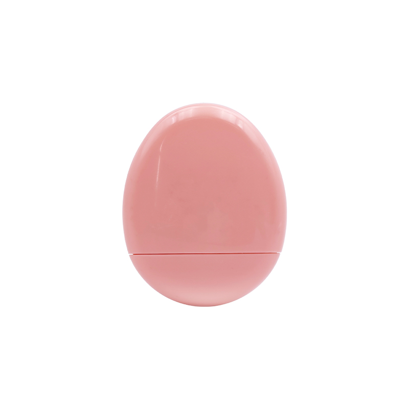
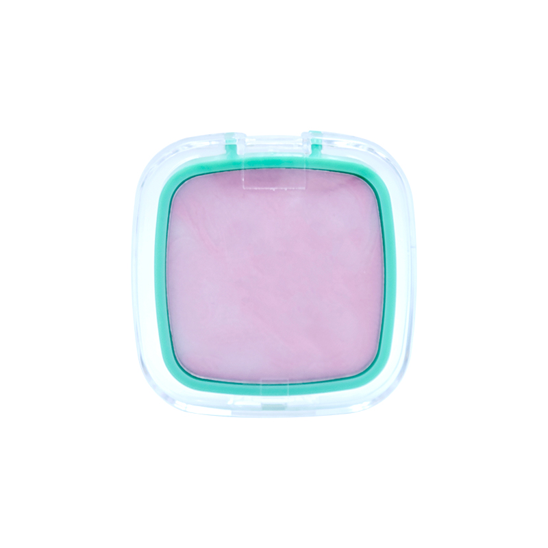
EGG-SHAPED BLUSH CREAM
TEXTURE OF CREAM MOUSSE THE PASTE IS SMOOTH AND HASGOOD COLOR VISIBILITY. Mo...
Color combination practice is not simply about placing several shades together. It involves observing how colors change when they sit beside, overlap, or balance one another. A palette with several coordinated shades can provide room for this kind of practice, especially when the colors have clear differences in tone and depth.
A useful arrangement does not need to make every shade dramatically different. Closely related colors can also be valuable because small changes in tone may become easier to notice when they are placed side by side. A combination can then be adjusted gradually rather than changed completely each time.
For eye makeup practice, the structure of the color selection matters as much as the individual shades. The relationship between light and dark colors, warm and cool tones, and soft or luminous finishes can influence how a combination appears.
A practical color palette gives enough room to compare different relationships without making every choice feel unrelated. Colors that share a common direction can form a natural base, while a contrasting shade can change the appearance of the entire combination.
The arrangement also matters. When related shades are placed close together, subtle differences are easier to compare. A darker shade beside a lighter one can show how depth changes the visual balance. A warmer color next to a cooler color may create a different impression even when their brightness is similar.
Color selection can be viewed through several simple relationships:
A palette designed for practice therefore needs more than a collection of unrelated colors. Some connection between the shades makes it easier to create combinations, while enough variation keeps the exercise from becoming repetitive.
The way colors are organized can also affect the learning process. A clearly arranged group allows different combinations to be compared without repeatedly searching for suitable shades. That practical aspect becomes useful when the purpose is observation rather than simply completing a finished makeup look.
Light and dark shades create one of the clearest forms of visual contrast. A lighter color can make an area appear softer, while a darker color can add definition or draw attention toward a smaller area.
Color combination practice becomes more useful when these differences are tested gradually. A light shade can remain as a base while another shade becomes progressively deeper. The change can then be observed without replacing the entire color arrangement.
Related colors are also suitable for this type of exercise. Several shades from a similar color family may move from pale to deeper tones, allowing the transition between them to be compared. The resulting combination may feel connected even though the depth changes across different areas.
Another approach is to combine colors from different families while keeping their brightness relatively close. Such an arrangement can show how hue differences influence the appearance without relying heavily on strong light-dark contrast.
| Combination Approach | Main Observation |
| Similar Shades | Gradual changes in color |
| Light and Dark Shades | Depth and visual layering |
| Warm and Cool Shades | Contrast between color directions |
| Soft and Bright Shades | Balance between subtle and vivid areas |
Careful adjustment is useful here. Adding several dark shades at once can make it harder to identify which change affected the overall appearance. Working with one noticeable change at a time gives a clearer view of how color depth influences the result.
Color temperature can change the feeling of a combination even when the basic depth remains similar. Warm colors may create a softer or warmer visual direction, while cool colors can introduce a different character.
The difference becomes easier to observe when related shades are compared under similar lighting conditions. A warm shade placed beside another warm shade may create a connected appearance. Introducing a cooler shade can change the relationship without requiring a large difference in brightness.
Color temperature can also be considered within the same general color family. Two shades may look closely related at a glance while producing different results when placed beside a third color. Such comparisons are useful because they encourage attention to relationships rather than isolated color names.
Practice can follow a simple pattern:
Lighting deserves attention because color appearance can shift with the surrounding environment. Warm indoor light, daylight, and mixed lighting may change how certain shades are perceived. Consistent observation conditions make comparisons easier and reduce confusion between an actual color difference and a lighting difference.
Warm and cool combinations do not need to be judged as simply suitable or unsuitable. The useful question is how the relationship changes the visual balance. A color that appears quiet beside one shade may become more noticeable beside another.

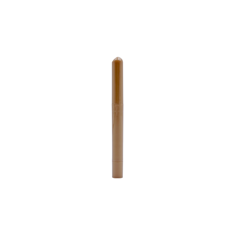
A Highlighter Eye Stick can introduce a different visual element into an existing eye makeup combination. Rather than functioning as another group of base colors, a highlighting product can be used in a limited area to observe how added brightness changes the surrounding shades.
The effect is easier to study when the underlying colors remain relatively simple. A soft base combined with a deeper shade can provide a clear setting for observing what happens when a luminous accent is introduced.
Several combinations can be compared:
The purpose of such practice is not to make every part of the eye area equally bright. A small change in brightness can be enough to alter the balance of the complete combination.
The position of the highlighting product also matters. Placing it in a different area can change where visual attention falls. Moving the accent while keeping the surrounding colors unchanged creates another simple way to study color and brightness together.
Texture can also influence the result. A color with a soft appearance may look different when placed next to a reflective surface, even when the underlying color family remains similar. That difference makes highlighting useful as part of color combination practice rather than as a separate step.
The relationship between the main colors and the luminous accent should remain clear. When too many visual changes are introduced at the same time, it becomes harder to identify the role of each element. Simple combinations provide a clearer basis for observation and adjustment.
Once the basic relationship between colors becomes clear, practice can move from simple comparisons toward more complete combinations. Changing several shades at the same time may make the result difficult to judge. Keeping part of the arrangement unchanged creates a clearer reference.
A simple approach is to begin with two shades. One can act as the base while another creates depth or contrast. After observing the result, the second shade can be replaced without changing the base. The difference between the two combinations then becomes easier to notice.
A third shade can be introduced later. Rather than adding it randomly, its role can be considered before application. It may connect two related colors, soften a strong contrast, or add depth to an otherwise light arrangement.
Another useful method is to keep the color family similar while changing the depth. Such a comparison helps show whether the visual change comes from color direction or from brightness.
Practice can also involve changing the position of a shade while keeping the selected colors unchanged. A color placed over a wider area may create a different impression from the same color used as a small accent.
The process can remain simple:
Such small adjustments make it easier to identify why a combination changes. The purpose is not to produce a fixed formula, since the same colors may appear differently under different lighting or with different textures.
Color combination practice becomes more meaningful when attention moves beyond individual shades. Several elements can be observed at the same time, including transitions, depth, color temperature, brightness, and texture.
A combination may contain colors that look attractive separately yet create an unexpected result when placed together. Looking at the complete arrangement helps reveal whether the colors support one another or compete for visual attention.
Several questions can guide observation:
The purpose of these questions is to encourage comparison rather than assign a simple positive or negative judgment. A strong contrast may be useful for one type of practice, while a softer transition may be more appropriate for another.
The amount of color used can also affect the result. A shade covering a larger area naturally has a different visual influence from a small accent. For this reason, color selection and application area need to be considered together.
Observation becomes clearer when only one variable changes at a time. Keeping the base colors and application areas consistent while testing a new supporting shade can reveal the role of that particular change.
Color does not appear independently from surface texture. A soft finish may give a shade a quieter appearance, while a reflective surface can make the same general color direction appear brighter.
Texture becomes particularly noticeable when two finishes are placed together. A soft color beside a luminous accent can create a visual difference even when their basic tones are closely related. Such differences can become part of combination practice.
A 9 Color Eyeshadow Palette can support this type of observation when its shades provide varied surface effects as well as different colors. The aim is not to collect as many finishes as possible. A useful arrangement gives enough variation to compare how texture changes the appearance of a selected color.
For practice, the following comparisons can be useful:
Texture should therefore be treated as part of the combination rather than an unrelated product feature. Once color and finish are considered together, the same shade may offer more than one way to practice.
Selection for color practice can begin with the intended type of comparison. A palette designed around closely related colors may suit gradual color changes, while a more varied arrangement may provide greater room for contrast exercises.
The internal relationship between shades deserves attention. Colors do not need to be identical in tone, yet they should offer some reasonable way to work together. Completely unrelated colors may be interesting individually while providing limited opportunities for connected combinations.
A practical selection can consider:
Packaging and layout can also influence daily use. Clearly separated shades are easier to identify, while a well-organized arrangement can make repeated testing less disruptive.
The selection process does not need to focus on the number of colors alone. A smaller group with useful relationships may provide more practical combination exercises than a larger collection of shades that have little connection.
For those using a Highlighter Eye Stick alongside a palette, compatibility between the highlighting effect and the available colors is another point worth considering. A subtle accent may work differently with a deep shade than with a pale or muted base. Such interaction adds another layer to color practice without requiring a separate color collection.
Repeated practice becomes easier to evaluate when the surrounding conditions remain reasonably consistent. Changes in lighting, application area, texture, or color selection can all affect the result, so changing too many factors at once makes comparison difficult.
A simple routine can help:
Short notes can be enough. A simple record of which colors were paired, where they were placed, and how the balance changed can make later comparisons easier. Such records also help separate personal preference from the actual relationship between colors.
Regular inspection of makeup products is part of the process as well. Changes in texture, contamination, damaged packaging, or unusual product condition may affect application and should not be ignored. Clean tools and appropriate storage also help keep repeated practice consistent.
Color combination practice does not depend on following one fixed arrangement. The value comes from observing how shades interact and gradually recognizing the differences created by depth, temperature, brightness, texture, and placement. A well-organized palette provides a practical setting for these comparisons, while a highlighting product can introduce another visual variable when needed.

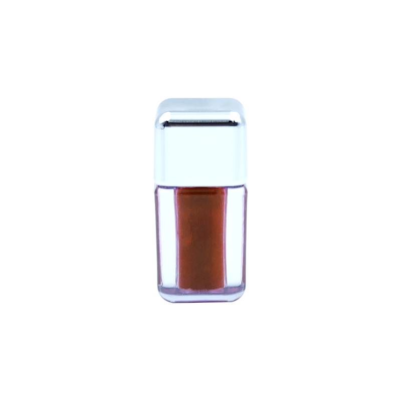
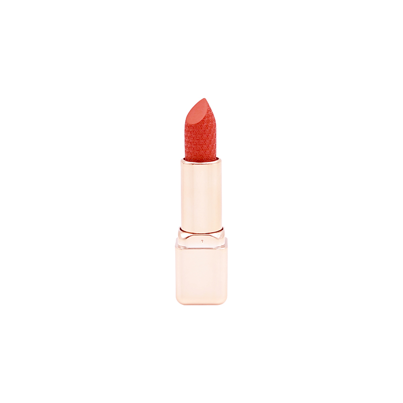
A lipstick often looks different in the tube than it does on the lips. Lip Color Changing Lipstick is formulated to de...
Lip makeup no longer has to mean one shade applied edge to edge. A soft tint can give a natural base, and a glossy oil...
Choosing a lip product isn't only about finding a suitable color. Consumers also consider how the color appears, how i...
Lip makeup has traditionally focused on adding color, while lip care has focused on keeping the lips feeling comfortab...
A cheek color can change the way facial proportions are perceived without altering the actual shape of the face. When th...
Everyday eye makeup does not always need strong color or a clearly defined shape. For work, casual outings, or simple so...


 No.333 Caihong Road,Linjiang Industry, Bailongqiao Town,Jinhua City, Zhejiang Province, China
 +86 13750973917+86 18248557685
 [email protected]
Copyright ©Zhejiang NiFei Cosmetic Co., Ltd. Rights Reserved.